Viki & Köpi Show
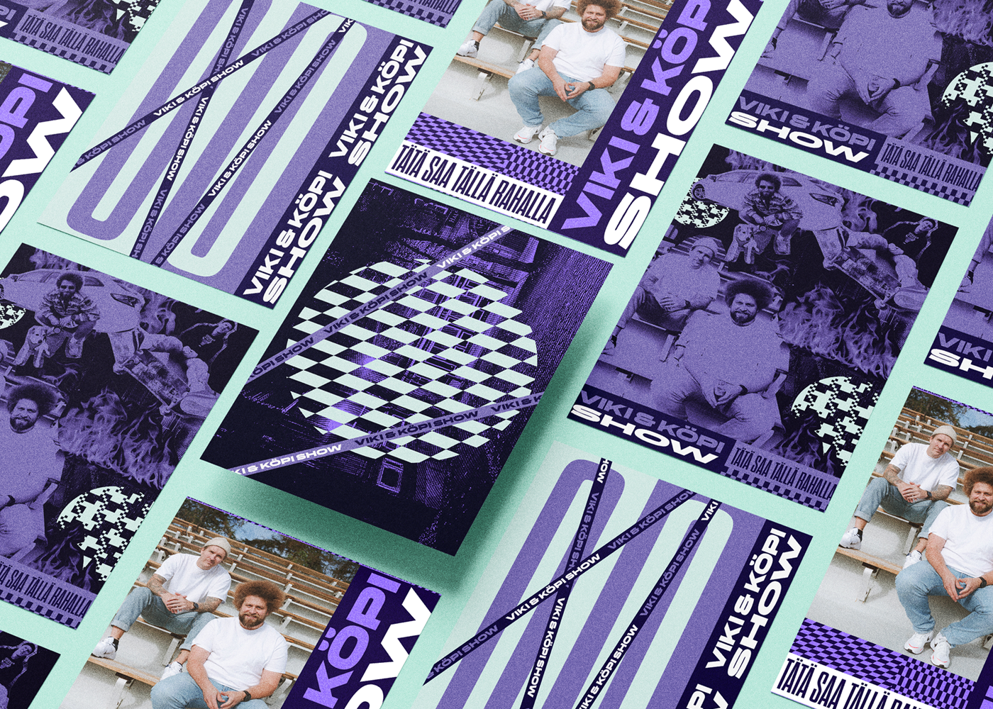
The familiar duo from YleX morning radio returned to entertain their listeners. Viki & Köpi show is a hybrid format which combines podcast with a tv show. We took care of the visual identity, prop designs and all the promo materials.
The program’s color scheme was made up of different shades of purple. With the atmosphere and look of the studio, we wanted to create a dusky, but cozy living room where the presenters can feel at home.
Our soul
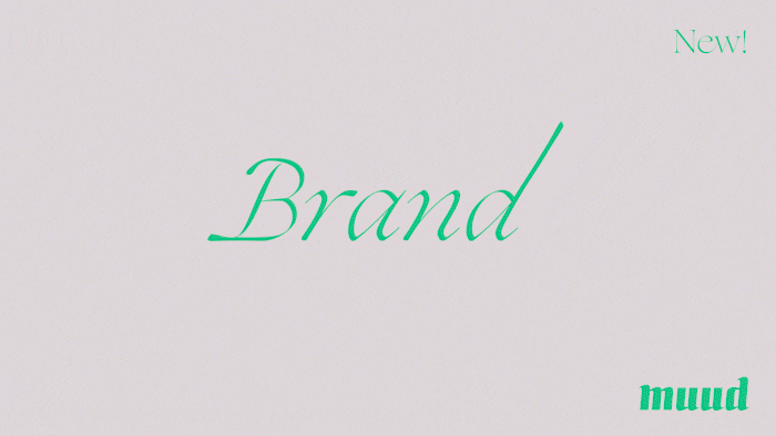
Finally it is out – The new visual identity of Muud! It has been a long creative process that led to this moment in which we are about to show you our final result. The brand was designed with three key aspects in mind: Collaboration, play, and the spirit of Muud. This brand reflects the soul of Muud and the people behind it.
Play The first key aspect of our new brand is play. The new Muud brand was created as a playground for the people to try out new things and learn different approaches to the design process. The core idea behind our brand was to create more space for play and experimentation. The fresh identity is diverse and enables the growth of creativity. We hope that the brand will tempt to play and try new things with design.
Collaboration Collaboration is the second key aspect of our visual identity. For us working together is the most enjoyable way of doing design. Top ideas are usually the shared ones. On our part, we want to break the individualistic idea of design and art heroes. Many of the famous artists we exhibit within our brand in reality had teams of assistants working together to achieve unbelievable results. Our brand emphasizes that we all exist together and sometimes need help from each other.
Fokus Dance
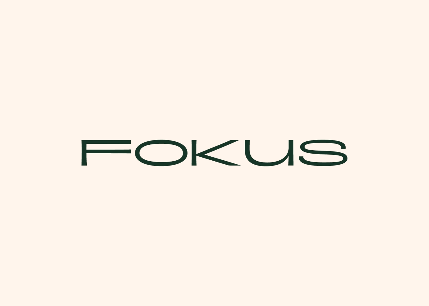
Visual identity for dance studio Fokus.
Fokus is a young, fresh and professional studio to take a variety of dance classes. They offer dance lessons for adults in contemporary dance, ballet and jazz. They also have children’s dance lessons for the youngest in the family aged 1-6.
We wanted to bring Fokus values out in the way they are seen in everyday dance studio business. Community spirit, openness, professionalism and safety emerged as the most important factors.
Lakiharju
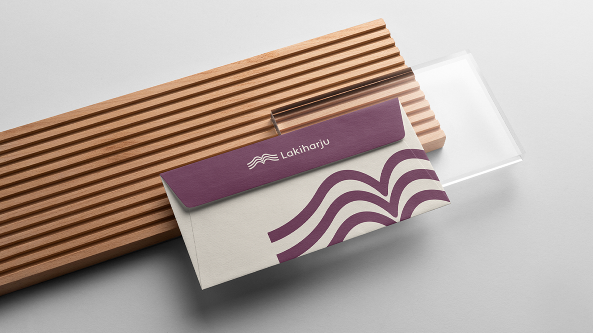
The visual identity for Lakiharju.
Lakiharju offers high-quality and solution-oriented legal services for different stages of life. The company’s operations are based on professionalism, closeness to people and responsibility.
Harju, located in Nummela, is a central place and it was wanted to be part of the brand’s logo. The logo combines the shapes and layers of the ridge and the law book. We wanted the visual ensemble to be fresh, believable and approachable. Dark burgundy was chosen as the main color, which reflects credibility. Beige and light green were chosen as fresh supporting colors, which in turn embody easy approachability. Various patterns from the logo serve as graphic elements.
Pulju Helsinki
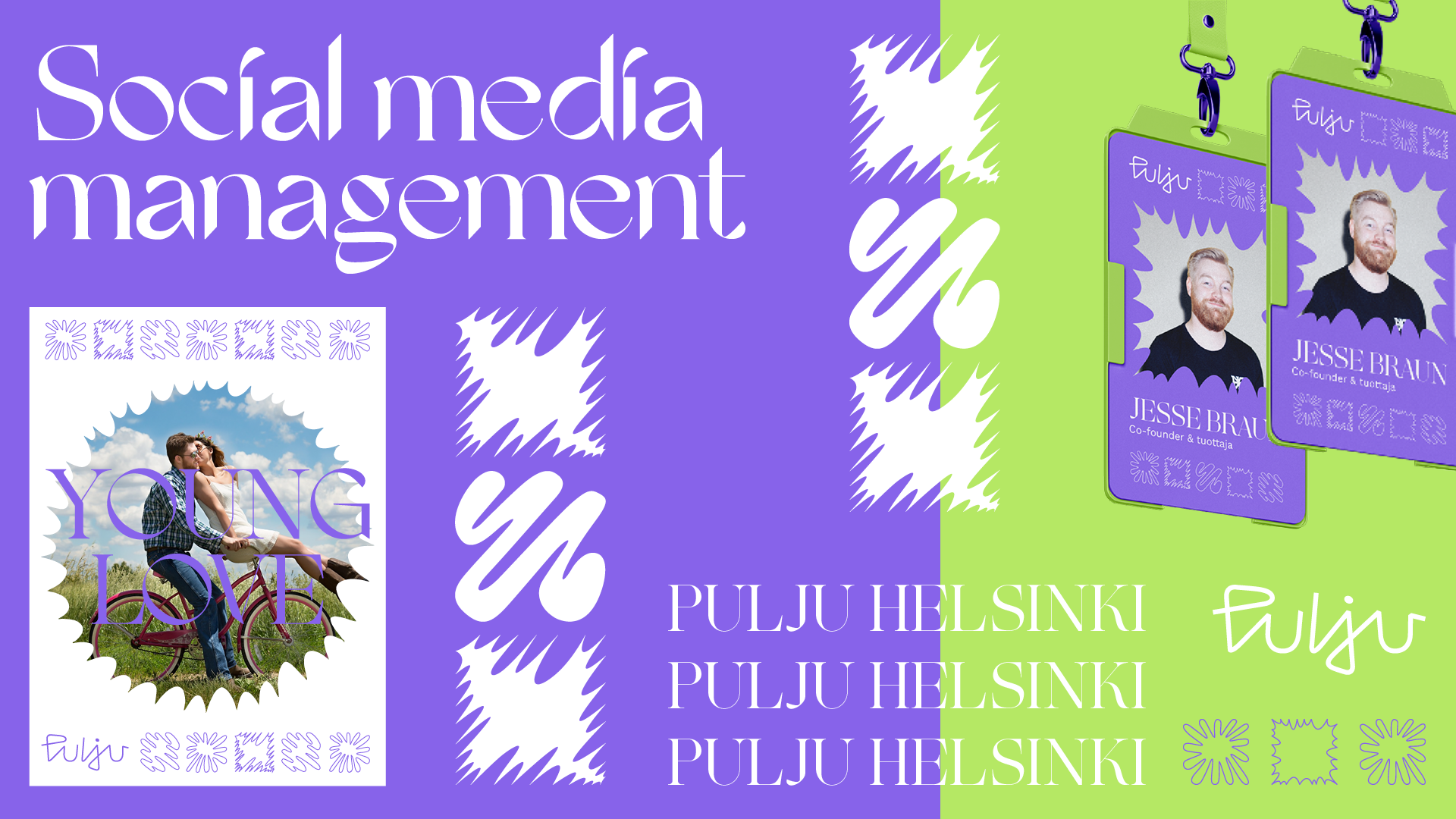
We designed the visual identity for social media agency Pulju Helsinki. Pulju’s business is based on non-traditional marketing methods, Which brings togehter connections as well as collaboration with consumers.
With this brand professionalism meets friskiness. The shapes of Pulju’s visual identity allows it to play and explore with creativity, following even the wildest lines.
This project includes a brand workshop, visual identity, logo, typography and website design.
Alex Mattson
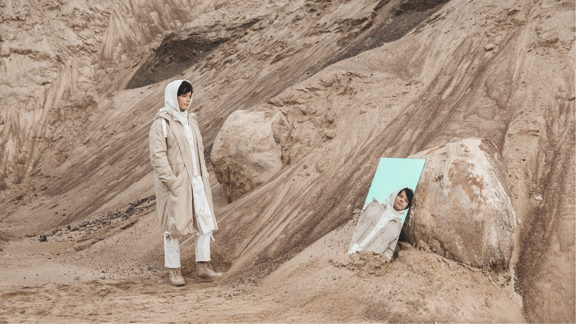
Brand identity, logo and promotional photos for Alex Mattson.
Alex Mattson has charmed Finland, the Baltics and the Nordic countries with his pop-hooked EDM songs.
The artist’s new visual look was implemented with clear, stylish graphics. A small sense of utopia was sought in the photographs.
Into Scandinavia
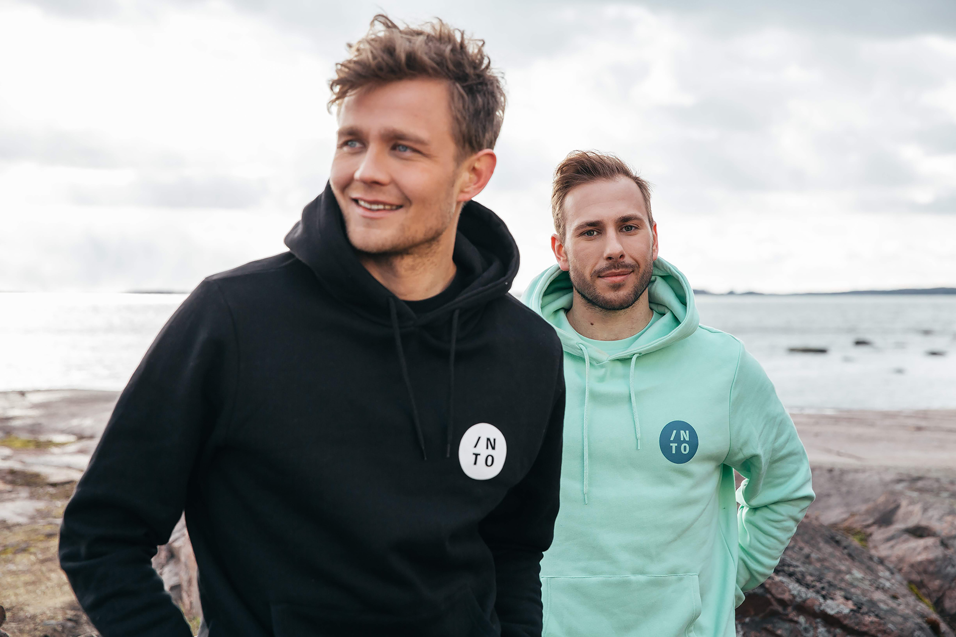
Brand identity, logo design & photography for Into Scandinavian Clothing.
Into Scandinavian Clothing emphasizes quality and careful finishing. In these shoots, we were looking for a fresh and timeless style. We defined the colors of the clothes and designed the details.
Wellpro Impact Solutions
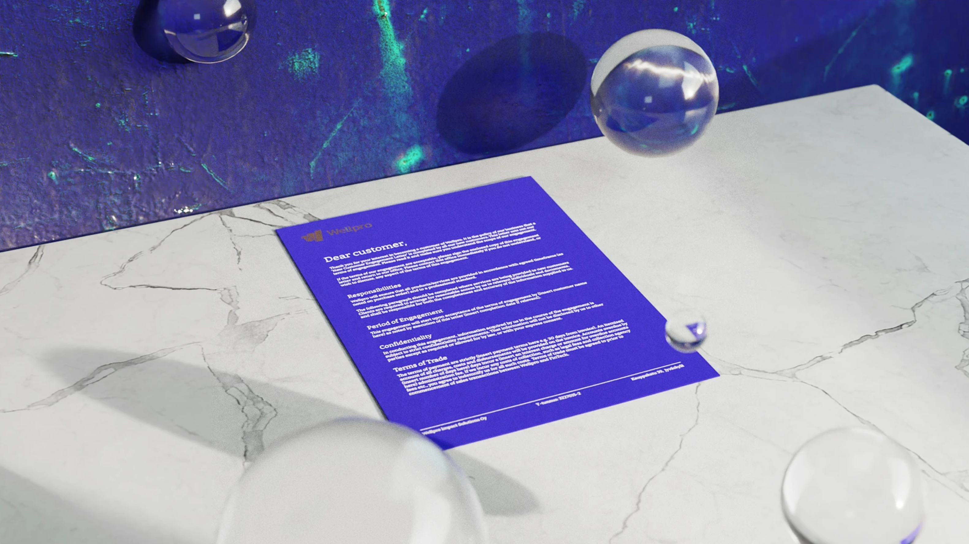
We made a whole new visual identity for Wellpro Impact Solutions. The goal was to build a distinct and linear long-lasting entirety.
This technology house of the future supports the promotion of people’s well-being and health. Wellpro assists companies in developing their operations with the help of research and data. The logosign reflects this while utilizing the letter W.
This project includes a brand workshop, visual identity, logo, typografia typography, a color palette, website design and prints.